My Role
Lead Product Designer | UX UI Design | User research
Team
2 Front-end engineers, 2 Back-end engineers, 2 Product Owners
Timeline & Status
2023, 9 months
Overview
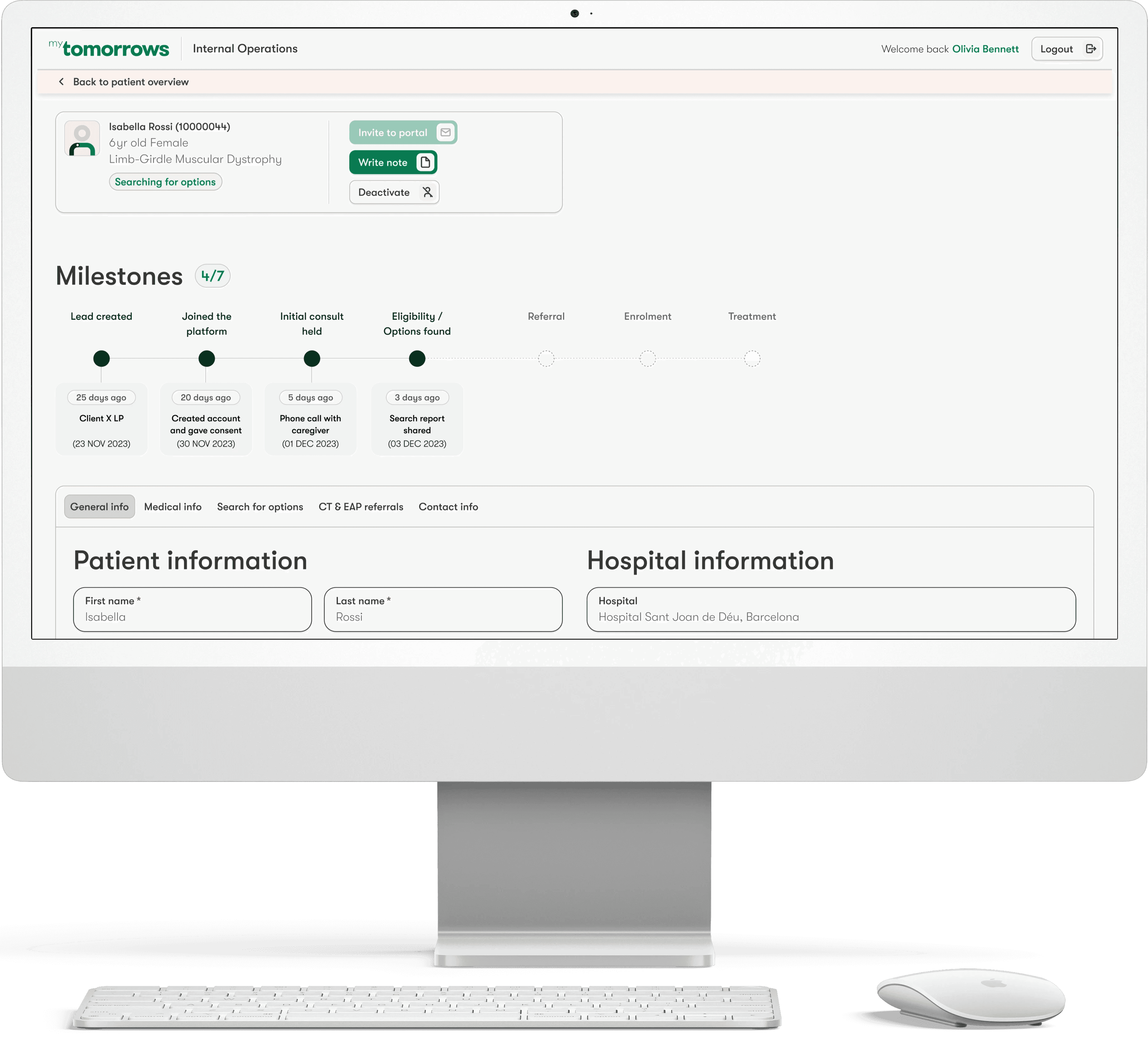
The Internal Operations view for Patient Navigators is a crucial part of myTomorrows’ digital platform. It plays an important role in running the daily operations of the company. Patient Navigators who use the platform are the first contact point of patients and their caregivers. They perform various steps in a patient’s journey including screening, triaging, or creating a Treatment Search Report, and ultimately choose a Clinical Trial or an Expanded Access Program. They also liaise with other stakeholders including treating physicians, clinical research teams, and biopharma clients.
Background
Due to new client reporting requirements and based on existing usability issues, at the beginning of 2023, a new Product team was born within myTomorrows with the mission to improve the tool that Patient Navigators (and other Operations team members) use on a daily basis. As a lead designer for this project during most of 2023, I discovered the pain points of the users and design within technical constraints while migrating to a new data structure. I improved usability which was a key metric.
Project goals
The Product team’s main focus points were to:
Design a new view that supports the migration to a new data structure meant to enable enhanced reporting and increased transparency for the clients
Reduce time and prevent errors in data entry done by Patient Navigators
Improve the workflows of Patient Navigators by offering automation
Improve the usability of the platform
Reduce the time to onboard new Patient Navigators joining myTomorrows
Constraints
Missing data analytics of the old portal usage, relying solely on qualitative research done (contextual inquiry, interviews, ethnographic research)
Internal and client requirements changed a lot, resulting in shortened feedback loops
A lot of new input fields were required by the business for reporting purposes, while not having enough clarity before the design steps started
The initial design solution was done with UI components from an interim design system. The next step was to apply the latest UI components which were later developed.
Design process
Here are some of the processes that led to various design iterations:
Heuristic analysis of the old UX
Refining design requirements based on new business needs around more accurate reporting
Jobs To Be Done workshop facilitated with Patient Navigators
Creating new personas to help stakeholders empathize with the users
New Information Architecture based on card sorting workshops with Patient Navigators
Designing and testing at wireframe level (show some examples)
Evaluation of the usability through UMUX methodology. Determined the baseline measure in Q2 2022 and the score for the improved version in Q3 2022.
Designing new UI components (UI screens/prototype - dummy data of patients / blurry parts)
Improving existing functionalities (filtering, saving information, searching for options, status tracking)
Designing new functionalities (note taking and tagging other users, allowing multiple patient journeys, requesting Treatment Search Reports, adding new EAP referrals)
Setting up feedback sessions with Product Owners, Front-end and Back-end engineers on the design work and adjusing iterations according to resource capacity and internal deadlines
Consulting with the other designers on our design strategy for consistency and work on UI components together
UX Design and User Research examples
Slideshow of UX and research processes
UI Design that were implemented
Outcomes & Takeaways
The most significant outcome as of Q4 2023 is having the Patients Navigators perform their work more efficiently and be less frustrated using the platform on a daily basis. They have successfully onboarded in the new view and have reported increased usability of the platform (around 50% increase so far measured in 2 points in time through UMUX methodology) compared to the old view. In addition, the clients were also more satisfied as the new data structure and design allowed the Operations team to provide better reporting.
Some quotes from the Patient Navigators in relation to the usability:
"The PNI 1.3 is definitely easier to use than the PNI 1.2 because fields are grouped together in tabs and the names of the fields are more intuitive."
"I find it easy to use now having time to get adjusted to the platform. The lay out makes sense and easy to navigate."
"The information is becoming easier and easier to enter, as boxes are being adjusted and the registration of the information is simplified."
Below a graph showcasing the UMUX measurements in Q2 and Q3, including the projection for Q4 and 2024 scores when aligning to the new design system.

Ideal UX/UI Design & New Design system
Since there were a lot of technical constraints and resource capacity issues, the ideal UX/UI Design could not be implemented by the time I had left the company. Here are some iterations that I proposed on the overview page, on the patient detail page, and the milestone feature.
The next big iteration is the alignment with the new design system (small preview of some components in the slideshow).
Slideshow of ideal UX/UI iterations
Want to know more about this project?
Feel free to contact me!


