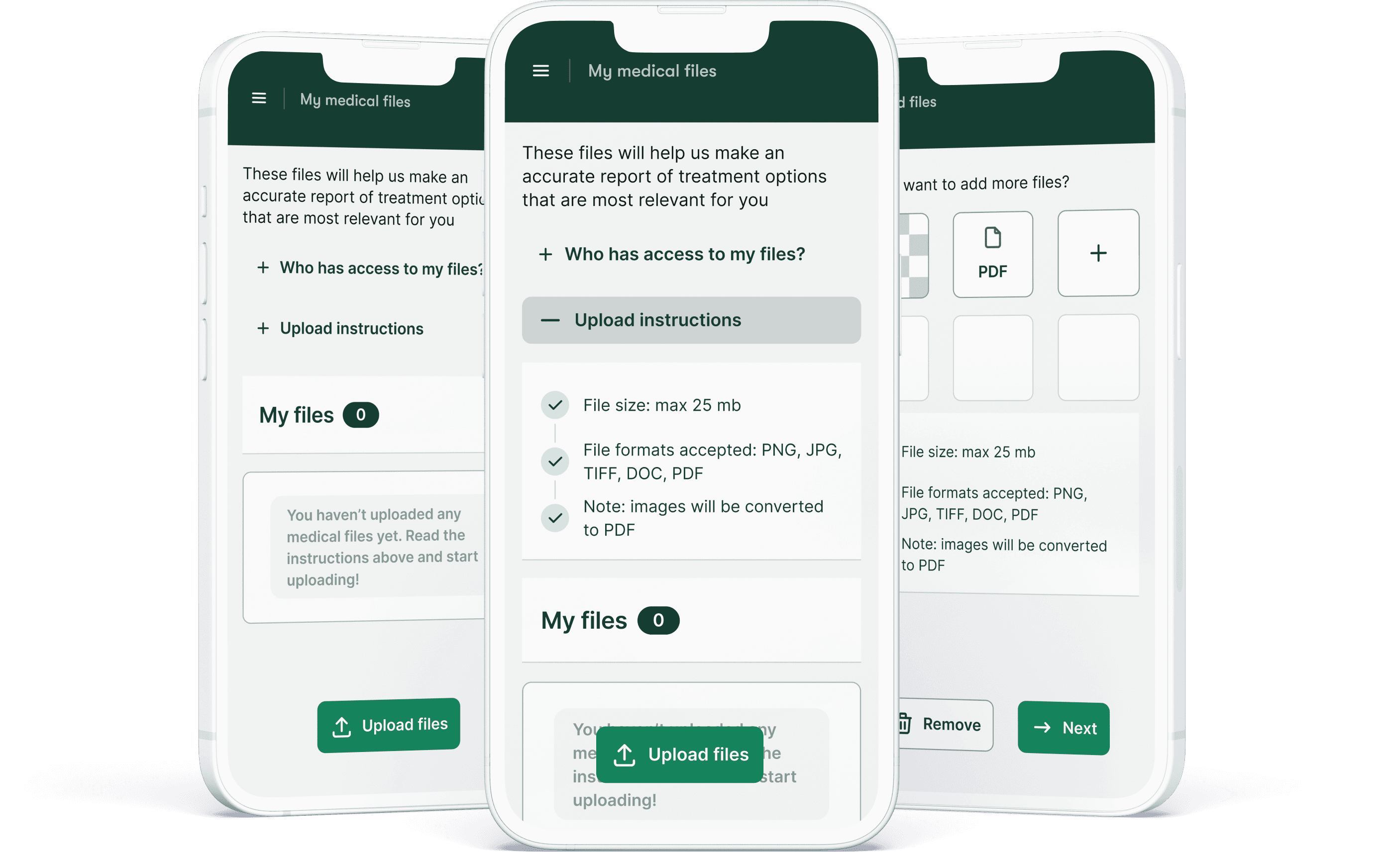
Manage patient files
My Role
UX UI | Visual design | User research
Team
2 Front-end Developers | 1 Visual Designer | more to come
Timeline & Status
2023, 2 months
Overview
Patients and caregivers use the myTomorrows Patient Portal to log into the platform to perform different activities that are necessary to get them referred to a clinical study. Due to the implementation of the old design system, the existing user experience for the patients was not optimal for mobile device users. In this design exploration project, I was given the opportunity to identify the flows that would benefit the users the most with an improved mobile-first experience. It is therefore still a work-in-progress mobile UX design and front-end project.
Background
The old patient portal did not allow patients and caregivers to properly manage their files, often leading to wrong files (sometimes not the required medical files) being uploaded to the myTomorrows platform. The users could not delete their files either, which was not desirable.
Based on user research, data analytics, and stakeholder feedback the mobile UX was a priority and when I took this project I decided to start with the mobile-first approach and look at relevant competitors on how to manage medical files.
Design goals
Mobile-first approach
Accessibility improvements
Easier management of files with more functionalities
Existing mental models associated with the tasks users have to complete
Language support
Design processes
Heuristic analysis
Competitor analysis
UX Design (sketch concept, wireframes, user flows)
UI Design
UX research planning
Feedback sessions with designers and PO
User flow example

Competitors & Accessibility

Testing the Mobile UX
After designing the main flow improvements (see below) I created a prototype at wireframe level to present the upload and manage file functionalities. The key functionalities are:
Upload multiple files
Add more files
Overview of files
Adding a note to a file
Download multiple files
Delete more files
View history
UI Design
For this design exploration I decided to test the new components from the new design system, and see if any adjustments were required.
Font size and certain components had to be adjusted to fit the mobile UX.


